
Friday 16 December 2016


Friday 9 December 2016
Little White Lies Annotation

Final Poster

This is the final poster idea the simple look reflects the main protagonist whilst linking to a thing most people do before interviews (get coffee) as well as that it reflects the film as the film is very minimalist and so is the poster, the incongruity of the coffee is funny to reflect that its a simple comedy.
In Design Mock Up Of Layout LWL

Typical Structure of Little White Lies Review
Lexis
The Lexis used in Little White Lies reviews is normally quite complex and whitty, we think this is because if the language used is complex than the audience begins to trust the opinion of the writer as they feel that they must be smart and well educated, this subsequently has the effect of validating the opinion of the writer, which helps to achieve the goal of the review which is to persuade and inform, and in this instance it persuades the reader by validating the writers opinion.
Structure
The structure of a review in the Little White Lies magazine is that there are between 5 and 7 paragraphs, however most of the time there are six. the first and/or second paragraph would be an introduction to the film and how the film was made, the third and fourth paragraphs are most likely to talk about the cast of the film and discus the movies basic plot with a short opinion, the final paraghraph/s is normally a review/conclusion on the film as a whole, this is typically where the writer signs off witha witty comment relating to the film to leave a lasting thought in the readers head almost like the strap line of the review.
Rating System
Rather than star ratings, Little White Lies rates films based on three things: Anticipation, Enjoyment, and in Retrospect, this allows for a broad and thorough review of each film that the reader can understand and enjoy as well as trust and relate too, it is hard to truly understand how good a film is based on 5 stars as everyones opinions are different and you can never see just how good the different main aspects of each film are, however this rating system is broad and covers all the aspects that a film lover (their target audience) would love to hear about.
Monday 5 December 2016
What are the layout conventions of LWL
The Layout of the magazine Little White Lies changes there theme each time there is a new addition and because the addition of the magazine targets different types of target audiences this influences the layout of the magazine. The magazine itself has a about 15 - 17 adverts in each addition, depending on who the target audience is depends on what adverts they put into the magazine. Most of the adverts in the magazine are advertising films that are out or that are coming soon, the type of film being advertised depends on the themes of the magazine and also the target audience for that issue.
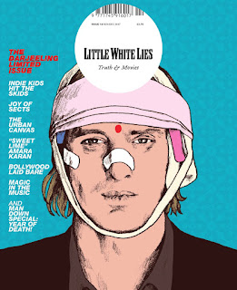
They cover of the magazine always has a different picture on it this picture is either of an actor or a film character and these are always drawn by hand. The layout of this cover however is again always the same, with the picture of the issue covering the whole cover and the title of the magazine Little White Lies at the top in the middle in a white circle. The title in the white circle makes the cover stand out but also it is recognisable.


They cover of the magazine always has a different picture on it this picture is either of an actor or a film character and these are always drawn by hand. The layout of this cover however is again always the same, with the picture of the issue covering the whole cover and the title of the magazine Little White Lies at the top in the middle in a white circle. The title in the white circle makes the cover stand out but also it is recognisable.

When they are creating the magazine they first place the adverts in the magazine and work there way around the adverts that have already been placed. However they need to input adverts based on the target audience between 25-35 year olds who are mostly male. The adverts are always going to be within that target audience range. The adverts however split up the sections of the magazine. For example, there would be a section on reviews and within that section you would have adverts to split up the different reviews.

The layout on the review pages are the same each time and are very specific with there measurements the image for this review is always placed at the top of the page the measurements for the picture page are 168mm x 70mm the image never goes to the edge of the page, either top or side it is always in the middle. The title of the film that they are reviewing always goes directly under the image and the director, starts and the release date are under each other, the title is always bigger than the rest as that is what they are reviewing. There are always three columns and there are always roughly 5-6 paragraphs. The measurements for this are also very specific this is so everything can fit on the page the measurements for the columns are 52.4 mm x 107mm.
There are three boxes in the bottom right of the page and there are always filled with ratings the rating are for anticipation, enjoyment and retrospect rating. These ratings are good as most of the time they are right with what they say.
Little white lies
Little White Lies is an internationally distributed movie magazine. It is published by London-based media company TCOLondon.

 This film review from the magazine Little White Lies clearly demonstrates the audience they are trying to go for. First of all we know they are not targeting a specific gender this is because the writing and layout is good for either men or woman. The writing it self is very specific it talks about the details of the film like the directors, and it assumes that the reader knows about each director and they're style, this tells us that the company is aiming for people with a lot of knowledge in the film industry already and so it assumes that the reader has a knowledge and passion for film so that it can cut out all the filler and get straight to the technical of each film, that appeals to the audience also because they already know a lot about film and so are only reading for key important facts and and techniques used by the crew of each film. we know that the magazine appeals to all ages above 16 because it has old and new film references and so is liked by all however kid below 16 wouldn't have watched the majority of films being reviewed due to some of there taboo natures.


Little White Lies rose out of the ashes of Adrenalin, an adventure sports and lifestyle magazine. When Adrenalin's publisher went bankrupt, a group of friends working there decided to turn designer Danny Miller's student degree project "Little White Lies: Issue Zero" into a full-fledged magazine.
The design of each issue is inspired by its feature film, often represented on the cover by an illustration of its lead actor. The cover film also influences interior aspects, such as editorial icons, chapter headings and custom typefaces. However, the overall template of the magazine remains the same. It was called "the best-designed film magazine on the shelf" in The Guardian. Its content is split into three acts: the lead review, a series of feature articles inspired by the cover film, and the reviews section, which also includes interviews with directors and stars of upcoming movies. The magazine uses a three part ranking system.] The categories ("'Anticipation", "Enjoyment", and "In Retrospect") are marked out of five and accompanied by explanatory text.

Jordan's Design Analysis for Little Whitle Lies
The design layout for the 'Little White Lies' magazine is a very unique and important part of the magazine, in every issue the style changes with the theme of the magazine, for example the front cover of the '1994' issue and the 'Django Unchained' issue is so different, with the colours and text.


As you can see they are two very different images, however they still share the same iconic 'LWL' logo. When you go in the magazine you see a similar pattern and that's that its not all just text then image, then text then image, its more bold words and art followed by illustrations on a double paged spread, so there design is such a unique one because no one else uses that kind of design.

But when you get to the review half of the book we start to see more of a structure; a set of about 5 - 10 pages of reviews with all the same layout, they use three column structure with the title in bold above it and then a picture of what this film is, then down the side is a rating of each part of the film.

The different fonts, sizes of fonts and use of bold and italics make this extremely clear to read, especially as every page is like this. For example the first word in the review, 'Remember' is so clear, and such a powerful start, all because of the drop text 'R' at the beginning gives it such a bold start off to the review. The title itself and text too is written in a very clear font that is easy to read, however it is a plain font making it look a little more sophisticated. I believe that the review page is designed like this because with the Big picture of the film at the top, it will be the first thing you read, then you would read the director, cast and release of the film and then on to the review. So the further down you read the more it becomes clear what the film is about, and what film your reading about, a very good way to captivate the readers, by putting the easiest thing to look at first because it makes you want to read on.
This design and layout really captivates the magazines target audience because of bright colour, complex text and beautiful art design, people reading have no choice but to be captivated in the art and beauty of the magazine, not one book has a boring, or similar design so it would never get old, the reason there never the same, and to why it captivates the audience so much is because they are always themed after a certain film, and as the audience that would be purchasing and reading these are filmmakers, filmgoers or students in film, this would suit them very well.
Subscribe to:
Posts (Atom)